
This was the first DPS I created in InDesign, I developed this
because I felt that it was too plain especially the second page, I decided to
change this by including a box behind the pull quote. I wanted to maintain the
theme colour but I found that a box with straight edges didn’t look very
appealing so I changed the shape of the edges. I felt that I also needed to
change the edges of the box behind the masthead to fit the trend.


I then developed the page further, and changed the layout of
the whole page I decided to have only one main image that covered one side with
the text on the adjacent side. I felt that this layout worked out much better.
 I decided to keep the layout of the page the same, but I decided
to change the main image. After looking through all the photos from my photo
shoot I decided that the image I used before wasn’t my strongest image so I
experimented on Photoshop with a few of my strongest images. I also decided to
change the font of the quote because I felt that it was too bold I wanted to
create a foster look. I also made changes to the back ground of the page with the text
on it to black because I felt that the contrast between the two pages was too
harsh. Here are some of the options I explored with my main images.
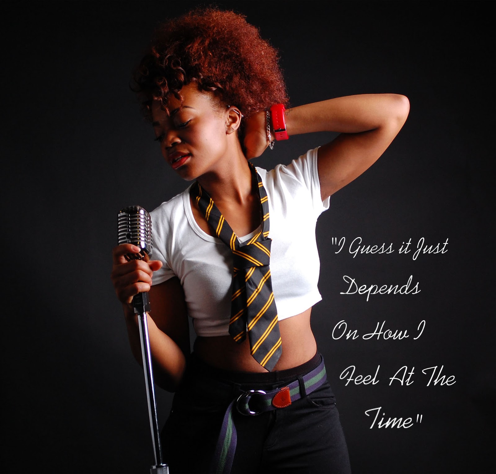
I decided to keep the layout of the page the same, but I decided
to change the main image. After looking through all the photos from my photo
shoot I decided that the image I used before wasn’t my strongest image so I
experimented on Photoshop with a few of my strongest images. I also decided to
change the font of the quote because I felt that it was too bold I wanted to
create a foster look. I also made changes to the back ground of the page with the text
on it to black because I felt that the contrast between the two pages was too
harsh. Here are some of the options I explored with my main images.


This is my final design, I feel that the main image is very strong and the front of the quote works really well with it. i also found that the logo on both pages didn't stand out as well against the black background because the 'S' was also black, i decided to change this to white so it was easier to recognise.

No comments:
Post a Comment